The ethical dimension of indigenous design - by Kevin Murray
http://www.indigodesignnetwork.org/?p=3868&cpage=1#comment-318
Tuesday, April 5, 2011

Monday, April 4, 2011
Aboriginal Motifs
Functions and Philosophies
Respect:
From the Visual arts protocol guide, it's shows a high respect of Aboriginal to protect their own cultural. Each cultural material and artwork have contain different background from the indigenous visuals artists to diversity their experience and cultural of their living and evolving. However, Indigenous artist are trying to find different approval from their community for different public projects in Australia. It uses Indigenous images, designs, stories and cultural expression as the main cultural material for each artwork and it contains the right and the control of heritage of the Indigenous people.
Communication, consultation and consent:
From the Indigenous community, For each Indigenous piece (such as artwork and images) may contain different culture affect and cultural differences, therefore, it's important to find the right person and community group for details. It's also important to ask permission to use for any tribal, creation stories and the traditional designs form the elder's Aboriginal. Permission also require to be ask for any photographs because it has been a major concern for the Indigenous people on the use of their images to be use as a promotions; images of the communities and the deceased people also need to be aware because it may cause distress.
Moral Rights and Issues
To produce a design that refer to the Aboriginal motifs permission and a brief discussion need to be asked with the Aboriginal community to show our respect to the Indigenous cultural.
http://www.australiacouncil.gov.au/__data/assets/pdf_file/0004/32368/Visual_arts_protocol_guide.pdf
Respect:
From the Visual arts protocol guide, it's shows a high respect of Aboriginal to protect their own cultural. Each cultural material and artwork have contain different background from the indigenous visuals artists to diversity their experience and cultural of their living and evolving. However, Indigenous artist are trying to find different approval from their community for different public projects in Australia. It uses Indigenous images, designs, stories and cultural expression as the main cultural material for each artwork and it contains the right and the control of heritage of the Indigenous people.
Communication, consultation and consent:
From the Indigenous community, For each Indigenous piece (such as artwork and images) may contain different culture affect and cultural differences, therefore, it's important to find the right person and community group for details. It's also important to ask permission to use for any tribal, creation stories and the traditional designs form the elder's Aboriginal. Permission also require to be ask for any photographs because it has been a major concern for the Indigenous people on the use of their images to be use as a promotions; images of the communities and the deceased people also need to be aware because it may cause distress.
Moral Rights and Issues
To produce a design that refer to the Aboriginal motifs permission and a brief discussion need to be asked with the Aboriginal community to show our respect to the Indigenous cultural.
http://www.australiacouncil.gov.au/__data/assets/pdf_file/0004/32368/Visual_arts_protocol_guide.pdf
Monday, March 28, 2011
Native American Motifs
Spokane Chiefs
Logos thorough history:
The elements and principle of design have been used in different ways in this design, such as shapes and the colour red have been used to represent their team sprite and passion of the team; Lines have been used as the outlines of this design to create a sense of depth in this design and it's also helped to bring out the hierarchy (the red "S" illustration) of this design.
From my opinion, this design has achieved it's intention because it shows a clear understand of it's motif and it's well use with design elements.
http://www.sportslogos.net/team.php?id=452
http://en.wikipedia.org/wiki/Spokane,_Washington
Logos thorough history:
 |
| 1985/86 - 1989/90 |
 |
| 1985/86 - 2001/02 |
The current Spokane Chiefs’s logo carries strong symbols of U.S.A and the Native American motifs because the Spokane Chiefs is a major junior ice hockey team from Spokane, Washington; Spokane is a city name drawn from the Native American tribe, which means “Children of the Sun” in Salish. The use of colours show a strong symbols of U.S.A because these are the main colours and repartition of United State (e.g. the U.S.A flag uses these colour to represent their country). The designers have used the illustration of the Native American’s hair decoration as apart of the team’s symbol.
The elements and principle of design have been used in different ways in this design, such as shapes and the colour red have been used to represent their team sprite and passion of the team; Lines have been used as the outlines of this design to create a sense of depth in this design and it's also helped to bring out the hierarchy (the red "S" illustration) of this design.
From my opinion, this design has achieved it's intention because it shows a clear understand of it's motif and it's well use with design elements.
 |
| 1990/91 - Pres |
http://www.sportslogos.net/team.php?id=452
http://en.wikipedia.org/wiki/Spokane,_Washington
Monday, March 21, 2011
Melbourne Sports Museum Critiques

The five Olympic rings
The five Olympic rings was design in 1912, by Baron Pierre de Coubertin. From this design, it’s clearly shown the use of negative and positive spaces; the five colour rings (blue, yellow, black, green, and red) are representing the positive space of this design. The negative space is white field behind the five rings. This design has also been create in motif 2D. These colours and the use of negative and positive space created a strong hierarchy for this design and other Olympics’ products; the connection of the five rings has also created a sense of rhythm.
Colours and shapes are the main elements used for this design, these elements carry a strong sense of Symbolism in this design to represent the five parts of the world which now are won over to Olympism and willing to accept healthy competition. In my opinion, this design has achieved its intention because the connections of the circle have clearly shown the sport sprits and the good relationship between each country. The uses of composition and colours have made this design successful and eye- catching.
http://en.wikipedia.org/wiki/Olympic_symbols
http://en.wikipedia.org/wiki/Symbolism_(arts)
http://tiny.cc/ldfgw


Hawthorn Football Club uniform
Hawthorn Football Club has used a hawk as the symbol and mascot for their logo design. This was first develop as a pre existing unofficial logo with the theme “A flying Hawk”. The Hawks’s Mascot Manor representative and club mascot is Hudson ‘Hawka’ Knights, a caricature of a hawk dressed the same way as the Hawthorn players. They have been using the same mascot since the first logo was produce in 1980s. The current logo was create with Brown and Gold with an illustration of a hawk’s head. There are 2 different designs for the current team’s uniforms. The home guernsey is the standard uniform of the team and it’s use for all the home and away games in Victoria, Sydney and Tasmania; the other version of the uniform called the away guernsey and it’s use in every away game in Adekaide Perth and Btisbane.
The current uniforms design were both designed on November, 2008. Both of these design have used colours and symbol (the Hawk logo) for the uniform design. From the home guernsey design, it has used strong vertical stripes of the Hawthorn brown and gold as the symbol and hireachy. However, the use of sponsor logo that locate on this guernsey has created an asymmetry layout of this design because the amount of logos that is used on both side does not match. The away guernsey has used a crop section of the logo as the focal point of this design and this has also create the positive(the hawk head) and negative (the white background) space for this design. However, this is also an asymmetry design because it contain a lot of information (sponsor logos and the hawk illustration) on one side.
Colour, rhythm and scale are the main elements and principles that are used in these designs, the use of colour have became the symbol and sprits of the team; the use of colour sprites and the sprites on the hawk's head have became the rhythm of this design and it create a sense of movement and the passion from the team. Colour Field and Symbolism are the main art styles that use in there design, they have used a large surface of solid colours in both designs and symbolism have been used with colours and the crop logo.
The concept of this design has follow the motto of the team "spectemur agendo" and it translates to "let us be judged by our acts". The hawk has also been use as apart of it's concept and it represent the Hawka Knight.
From my research, I think these designs have achieved its intention because the use of colours and elements have shown as a strong symbol of this team and it's an eye catching design.
The concept of this design has follow the motto of the team "spectemur agendo" and it translates to "let us be judged by our acts". The hawk has also been use as apart of it's concept and it represent the Hawka Knight.
From my research, I think these designs have achieved its intention because the use of colours and elements have shown as a strong symbol of this team and it's an eye catching design.
http://www.bigfooty.com/forum/showthread.php?t=793684
http://en.wikipedia.org/wiki/Hawthorn_Football_Club
Tuesday, March 8, 2011
Critiquing tools
ART VOCABULARY LIST
Positive Space refer to the shapes of the objects.
Negative space is the shape around the object.
Asymmetry balance is characterised by the arrangement of the element that is not mirrored or equal in appearance.
Cross Hatch is use to produce an ink pen drawing. it's a rapid method of creating tone by using vertical, horizontal and diagonal lines vary in proximity to on another to create tonal and textural variations.
Hierarchy means the element that leads your eyes drawn first and the element that stand out the most from each design. The use of scale, colours, shapes and textures can be use to create the hierarchy element.
ADJECTIVE LIST
Calligraphy is a smooth line that content a thick and thin size on the same stroke. It is a technique to make beautiful or elegant handwriting. It is a fine art of skilled penmanship.
Pigment is a material that change colours of reflected or transmitted light.
Triad is a colour that composed with 3 colour spaced equal distance apart on the colour wheel and they don't have a strong contrast as between the complements.
Flat are shape that are 2 dimensional.
Scale is the relative size of element within a composition, it can be refer to size to assists the viewer make a sense of depth, distance and proportions in a composition.
Positive Space refer to the shapes of the objects.
Negative space is the shape around the object.
Asymmetry balance is characterised by the arrangement of the element that is not mirrored or equal in appearance.
Cross Hatch is use to produce an ink pen drawing. it's a rapid method of creating tone by using vertical, horizontal and diagonal lines vary in proximity to on another to create tonal and textural variations.
Hierarchy means the element that leads your eyes drawn first and the element that stand out the most from each design. The use of scale, colours, shapes and textures can be use to create the hierarchy element.
ADJECTIVE LIST
Calligraphy is a smooth line that content a thick and thin size on the same stroke. It is a technique to make beautiful or elegant handwriting. It is a fine art of skilled penmanship.
Pigment is a material that change colours of reflected or transmitted light.
Triad is a colour that composed with 3 colour spaced equal distance apart on the colour wheel and they don't have a strong contrast as between the complements.
Flat are shape that are 2 dimensional.
Freehand line are lines that are draw without any tools.
BASIC ELEMENTS OF DESIGN
Line is a versatile design element with the only dingle dimension of length. It can be use as the outline any drawing and the appropriate dimension dimension line in varying types. it can be create in different width and weight such as fine or light, bold or heavy lines. Lines can also use to create tones.
Colour is the most powerful element for design. in traditional theory, there are 3 pigment that can not be mix or formed my any other combination of other colour. Colours can also be define in different ways such as Hue (red, blue and yellow); Primary colours, Secondary colours, warm and cool colours.
texture can be assist in describing the detail of an object, it is use to represent the sense of touch and help us to recognise and understand the feature of the environment.
shape is generally to describes representational or abstract shapes that are 2 dimensional. it can be define as simple geometric shapes (squares, triangles, rectangles and circle) and Irregular or abstract shapes.
form is generally refers to objects that are 3 dimensional.
BASIC PRINCIPLES OF DESIGN
Stability is use to define balance for the use of elements in each design.
Dynamic is use to describe the visual movement for each design
Rhythm in art is a portrayal of art that looks and feels like it has a sense of beat such as the rhythm that use in colour, shape, size and wheather the use of repetition to enhance it is used
Scale is the relative size of element within a composition, it can be refer to size to assists the viewer make a sense of depth, distance and proportions in a composition.
Style Time Line
The Arts and Crafts Movement
 The Arts and Crafts Movement was created by the English man call William Morris. It was develop in England during the latter half of 19th century and it was flourished between 1880 and 1910. This movement is a reaction of against the Industrial Revolution. Different artists, architects, designers, craftsmen and writers were a part of this movement and they were feared that the environment would be destroyed by the industrialization. This Movement advocated the truth to the materials and using simple forms, romantic or folk styles for decoration and medieval as a traditional craftsmanship.
William Morris was the central figure for the Arts and Crafts Movement, he has used this movement to created different decorative objects such as furniture, stained glass, textiles and wallpapers.
2 artist and Designers:
Pauline Fjelde & William Morris
2 artist and Designers:
Pauline Fjelde & William Morris
http://tiny.cc/sn9dr
http://tiny.cc/kgwsr
Classical Realism
 Classical Realism was originate with the Minneapolis artist called Richard Lack in 1982 and it started from his art exhibition in 1982. It is a characterised by a love for the visible world and great traditions of the Western art that include Classicism, Realism and Impressionism. Classical is the aesthetic for this movement and it's preference for order, beauty, harmony and completeness. This movement is differs from the art movement of Photorealism and Hyperrealism. This movement also refers to artistic's movement for painting in late 20th century and the combine elements of neoclassicism and realism from the 19th century. Lack also define this style to embraces with the traditions of European art. According from Richard Lack, Classical Realism is "Any 20th-century painting that suggests a recognizable object, however crudely or childishly rendered, qualifies as 'realistic.' Obviously, the simple word realism, when applied to painting, has become so broad in its sweep and general in its application that it is no longer meaningful."
2 artist and designer:
Charles H. Cecil Studios & Graydon Parrish
http://en.wikipedia.org/wiki/Classical_Realism
http://www.artrenewal.org/articles/2009/Classical_Realism/ClassicalRealism.php
http://www.ioffer.com/si/children+magazines?price=6
Folk art
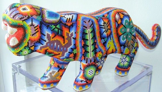
 Folk art is create at the late 19th century, it produces from an indigenous and traditional culture that is reflected the among of art with common people if nation or region. It is also primarily use for everyday or festive item produced and decorated by unschool artists to show their own criteria of function and craftsmanship and design. Folk art often used as a decorative and patterns and painting.
2 Artist and Designer:
Peter Hunt & Howard Finster
http://www.britannica.com/EBchecked/topic/212096/folk-art/50071/Style
http://en.wikipedia.org/wiki/Folk_art
http://au.alibaba.com/product/106911734-Huichol-indian-folk-art-bead-work.html
http://www.answers.com/topic/arts-and-crafts-movement
Graffiti
 Graffiti was create in 1960s at New York, it is an artwork that create for lettering scratched, name images, scrawled and painted. It is a pubic type of art that appear in simple written words and wall painting. These artist are passionated, skilled, community oriented and socially conscious, they also portrayed as the criminal and vandals. Graffiti culture has include Activism, Direct action, Hip hop culture, stencil, spray paint art, and screen printing.
2 artist and designer:
Banksy & Miss Van
http://en.wikipedia.org/wiki/Graffiti
http://csdt.rpi.edu/subcult/grafitti/culture/Birth_and_Evolution.html
http://www.smashingmagazine.com/2008/09/14/tribute-to-graffiti-50-beautiful-graffiti-artworks/
International Typographic Style
 THe International Typographic Style was developed in Switzerland in 1950s, it's also known as the Swiss style. it's a style where it's emphasizes cleanliness, readability and objectivity and it carries a hallmarks of asymmetric layouts by using grid and sans serif typeface that flush left.
2 artist and designer:
Max Miedinger & Richard Paul Lohse
http://smearedblackink.com/swiss_style_timeline/
http://www.internationalposter.com/style-primer/international-typographic.aspx
http://en.wikipedia.org/wiki/International_Typographic_Style
http://www.sepetdanmerak.blogspot.com/2010_04_01_archive.html
Pop Art
 Pop art is a popular culture that was created in the mid 1950s in Britain and late 1950s in the United States. It is a representational art as artists response on using mpersonal, mundane reality, irony and parody to express their personal symbolism and painterly looseness for Abstract Expressionism. This style also remove the materials from the context and isolates object and combines. It also created an aspects of Mass culture on advertising, comic and mundane cultural.
2 artist and designer:
David Hockney & Andy Warhol
http://en.wikipedia.org/wiki/Pop_art
http://www.artchive.com/artchive/pop_art.html
http://www.notcot.org/post/5570/
Qajar art
 Qajar art was create on 1781 to 1925. It's an art movement that refers to the art forms of Persian Empire of Qajar dynasty. The portraiture of distinctive style is recognizable as part of the Qajar art. This style can be found from the the European style, textile, architecture and the roots of the traditional of Qajar painting during the preceding of Safavid empire.
2 artist and designer:
Mihr 'Ali.
http://en.wikipedia.org/wiki/Qajar_art
http://tiny.cc/llpxt
http://tiny.cc/xveg8
Pixel Art
 pixel art is a form of digital art that created by using raster graphics software to edit images with a pixel level. It was first use for old computer's graphic display and video games. This was first publish in 1982 by the Adele Goldberg and Robert Flegal of Xeroox Palo Alto Research Center. Similar to bead art, Pixel art is create by putting small coloured units together, this is similar to modern digital image.
2 artist and designer:
Paul Robertson & Gary J Lucken
http://en.wikipedia.org/wiki/Pixel_art
http://psd.tutsplus.com/articles/inspiration/20-inspiring-pixel-artists-tutorials-and-resources/
http://www.flickr.com/photos/nickgray/2434200018/
Space Art
 Space Art was started in 1993, artist used their knowledge and idea of the outer space to use as a source for their inspiration and means for visualizing and promoting space travel. Most Space art artist have generated their work as Illustration and painting to communicate scientific discoveries.This movement have given a opportunity to expand and combine art, science, humanities and cultural.
2 artist and designer:
Michael Carroll & Ron Miller
http://en.wikipedia.org/wiki/Space_art
http://tiny.cc/kgwsr
Classical Realism

2 artist and designer:
Charles H. Cecil Studios & Graydon Parrish
http://en.wikipedia.org/wiki/Classical_Realism
http://www.artrenewal.org/articles/2009/Classical_Realism/ClassicalRealism.php
http://www.ioffer.com/si/children+magazines?price=6
Folk art
2 Artist and Designer:
Peter Hunt & Howard Finster
http://www.britannica.com/EBchecked/topic/212096/folk-art/50071/Style
http://en.wikipedia.org/wiki/Folk_art
http://au.alibaba.com/product/106911734-Huichol-indian-folk-art-bead-work.html
http://www.answers.com/topic/arts-and-crafts-movement
Graffiti

2 artist and designer:
Banksy & Miss Van
http://en.wikipedia.org/wiki/Graffiti
http://csdt.rpi.edu/subcult/grafitti/culture/Birth_and_Evolution.html
http://www.smashingmagazine.com/2008/09/14/tribute-to-graffiti-50-beautiful-graffiti-artworks/
International Typographic Style

2 artist and designer:
Max Miedinger & Richard Paul Lohse
http://smearedblackink.com/swiss_style_timeline/
http://www.internationalposter.com/style-primer/international-typographic.aspx
http://en.wikipedia.org/wiki/International_Typographic_Style
http://www.sepetdanmerak.blogspot.com/2010_04_01_archive.html
Pop Art
 Pop art is a popular culture that was created in the mid 1950s in Britain and late 1950s in the United States. It is a representational art as artists response on using mpersonal, mundane reality, irony and parody to express their personal symbolism and painterly looseness for Abstract Expressionism. This style also remove the materials from the context and isolates object and combines. It also created an aspects of Mass culture on advertising, comic and mundane cultural.
2 artist and designer:
David Hockney & Andy Warhol
http://en.wikipedia.org/wiki/Pop_art
http://www.artchive.com/artchive/pop_art.html
http://www.notcot.org/post/5570/
Qajar art
 Qajar art was create on 1781 to 1925. It's an art movement that refers to the art forms of Persian Empire of Qajar dynasty. The portraiture of distinctive style is recognizable as part of the Qajar art. This style can be found from the the European style, textile, architecture and the roots of the traditional of Qajar painting during the preceding of Safavid empire.
 2 artist and designer:
Mihr 'Ali.
http://en.wikipedia.org/wiki/Qajar_art
http://tiny.cc/llpxt
http://tiny.cc/xveg8
Pixel Art
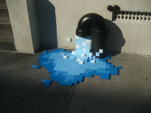 pixel art is a form of digital art that created by using raster graphics software to edit images with a pixel level. It was first use for old computer's graphic display and video games. This was first publish in 1982 by the Adele Goldberg and Robert Flegal of Xeroox Palo Alto Research Center. Similar to bead art, Pixel art is create by putting small coloured units together, this is similar to modern digital image.
2 artist and designer:
Paul Robertson & Gary J Lucken
http://en.wikipedia.org/wiki/Pixel_art
http://psd.tutsplus.com/articles/inspiration/20-inspiring-pixel-artists-tutorials-and-resources/
http://www.flickr.com/photos/nickgray/2434200018/
Space Art

2 artist and designer:
Michael Carroll & Ron Miller
http://en.wikipedia.org/wiki/Space_art
http://www.astrored.org/astrofotos/albums/Arte/Planetas/Space+Art+Wallpapers+06.jpg.html
Street Art
 Street Art have begin in the 16th century at France. It is an art development in public space, similar to graffitti, street art has also include stencilgraffit, sticker art and street poster art. However, street art is also known as a part of post graffiti where they are used to distinguish the comtemporary public space of artwork.
2 Artist and designer:
Bansky & Zach Freshwater
http://www.artistswa.com/category/street-artist/
http://wiki.answers.com/Q/What_year_did_street_art_begin
http://en.wikipedia.org/wiki/Street_art
Tuesday, February 22, 2011
Aphrodite research
Aphrodite the Greek God of Love, beauty and Sexual

Appearance
Most people recognize Aphrodite as a young beautiful Greek god who is Love, beauty and sexual from her appearance. She is also represent as the goodness of elegant this is shown from the dressed outfit.
History
Aphrodite is also known as the Lady of Cythera (Cytherea) was born of the sea foam near Paphos and been sent away to an island. According to the homer, she was legally married to the god of fire, Hephaestus, but she was Eros, Harmonia, Fear and Panic from this relationship and she’s unfaithful to Hephaestus with Ares. Harmonia is the daughter of Aphrodite and Ares; she represents the concept of love and hate as well as disaster and creation of life. However, apart from gods, her lustful desires for mortals; Zeus has instilled her with the lust for morals as a punishment for her. Aphrodite was also infatuate with Anchises and the young myth Adonis. As Aphrodite being the goddess of love she has involvement in other love affairs and this has course an astound side effects and led to an outbreak of wars.
 Relationship
She is the daughter of Zeus and Dione with the sibling of the Tree Nymphs, Furies and the Gigantes. Zeus has married her to the Olympian God of Iron called Hephaestus because Aphrodite was love by many different gods and mortals. However, her heart was devoted to the god of war, Ares and they were having a passionate secret love affair. She is the mother of Eros, Phobos, Deimos, Harmonia, Pothos, Anteros, Himeros, Hermaphroditos, Rhode, Eryx, Peitho, Tyche, Eunomia, The Graces, Priapus and Aeneas.
Adventures
Aphrodite’s infatuation with Anchises has begun to love Aphrodite when she caught him. She has pretended to be Phrygian king Otreus’s daughter (a normal mortal) and come to marry him. Anchises realized that she’s a lustful goddess rather than a mortal and assured him that she won’t harm him; she has also bear him a son called Aeneas. She has also implored the young mortal never reveal her true identity of her son.
Symbols
 Aphrodite has carried a large number of goddess symbols in different field such as
Generals: Scallop shell, seashells, mirrors, golden apples, the Evening Star (planet Venus), Number 5, the ocean, and the triangle
Animals: Dolphin, swan, dove, sparrow, bees, and goats
Plants: Rose (especially any fragrant rose), quince, myrtle, mint and grape (fruit, leaves, and vines), apples, artichokes, laurel, ash and poplar trees
Perfumes/ Scents: Stephanotis, musk, verbena, vanilla, incense, vervain, and roses
Gems and Metals: Pearls, gold, aquamarine, rose quartz, jade, sapphire, silver, and copper
Colours: Red, pink, violet, silver, aqua, pale green (seafoam), and any shade of light blue
Sport used to symbolize
Aphrodite can be involved with any sport that is related with water/ ocean such as swimming and diving
Sources:
Subscribe to:
Posts (Atom)